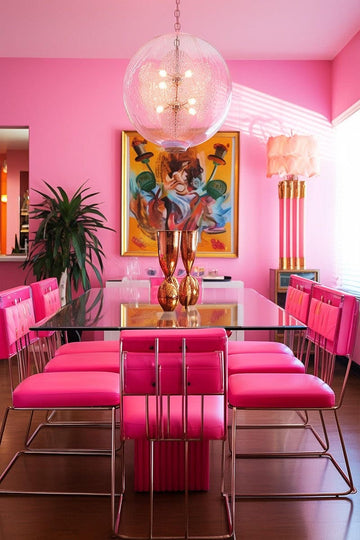


Why settle for one paint colour, when you can pick two!?
I love this mantra, especially as someone who has a major soft-spot for maximalism.
Two-toned walls create instant contrast and architectural interest with just a few strokes of paint.

Before you get started a couple of key things to consider are, at what height you want to divide the wall (remember it doesn’t have to be exactly split in half!) and what colours do you already have within the space that you’ll be drawing your inspo from for the two paint colours.
If you’re struggling with knowing where to divide the wall, start by using an existing feature in the room such as a door frame, couch height or fire surrounds. A fun idea to use this trend in an older style home is to divide the room roughly to where the picture moulding would usually have been positioned (approximately 50cms below the ceiling).

Now that you’ve chosen your height, decide on two-complimentary colours. Obviously, I’m going to say the bolder the better but work with existing pieces in the room to make sure the space all works together. Grab yourself a number of test pots and start putting two colours next to each other to fully understand what they’re going to look like once on the wall.
The most commonly asked question has to be, “But how do I decide what colour goes on the top and what one goes on the bottom?”. This is a very simple decision. The heavier or darker colour goes on the bottom to anchor the wall with the lighter or brighter shade above it. This technique of grounding with the lighter colour above will also make the room feel taller.
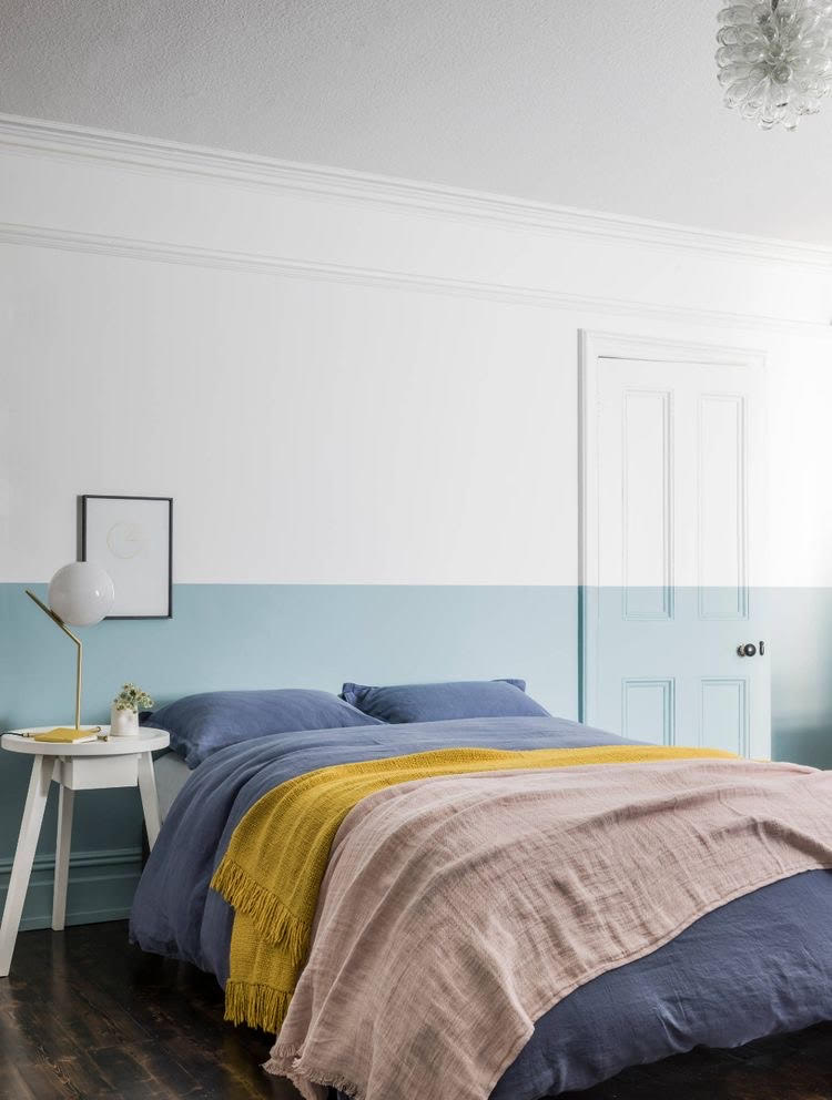
I’ve sourced some of my favorute examples of this trend from Pinterest and added my pick of the Resene colours to achieve a similar look.Simple black/white: Resene Nero and Eighth Thorndon Cream (this is a warmer white).
If you’re wanting to pair a colour with a cleaner white then I would go for Resene Alabaster and being a pink lover I love the effect Resene Half Pale Rose looks with it.